
問題2:斜め線のデザインを作成しよう
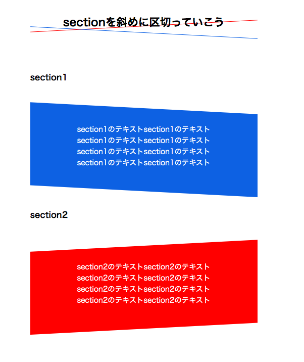
sectionの区切りを斜め線で区切ってみましょう。
見本を参考に作成してください。
見本を参考に作成してください。
期待する画面

解答ソースコード
<h1>sectionを斜めに区切っていこう</h1>
<section class="section-wrap">
<h2>section1</h2>
<section class="section section--cat1">
<p>section1のテキストsection1のテキスト</p>
</section>
<h2>section2</h2>
<section class="section section--cat2">
<p>section2のテキストsection2のテキスト</p>
</section>
</section>
¥HTML¥
body {
width: 500px;
margin: auto;
text-align: center;
}
h1 {
position: relative;
font-weight: bold;
font-size: 24px;
}
h1::before {
content: ';
position: absolute;
bottom: 10px;
left: 0;
width: 100%;
height: 1px;
margin: auto;
background: #FE2E2E;
transform-origin: bottom;
transform: rotate(-3deg);
z-index: -1;
}
h1::after {
content: ';
position: absolute;
bottom: -5px;
left: 0;
width: 100%;
height: 1px;
margin: auto;
background: #0e6edf;
transform-origin: bottom;
transform: rotate(3deg);
z-index: -1;
}
h2 {
text-align: left;
font-weight: bold;
font-size: 18px;
}
.section-wrap {
margin: 24px 0;
padding: 65px 0;
}
.section {
position: relative;
overflow: hidden;
color: #fff;
margin: 24px 0;
padding: 65px 0;
}
.section--cat1::before,
.section--cat2::before {
content: ';
position: absolute;
top: 0;
left: 0;
width: 120%;
height: 80%;
margin: 3% -10% 0;
z-index: -1;
}
.section--cat1::before {
background: #0e6edf;
-ms-transform-origin: left center;
transform-origin: left center;
transform: rotate(3deg);
}
.section--cat2::before {
background: #FE2E2E;
transform-origin: right center;
transform: rotate(-3deg);
}
¥CSS¥
補足
今回作成した赤と青の背景は、ボックスを作り、傾かせた上でoverflow: hidden;を使うという少し難易度の高い方法で作成しています。
今回のようにz-indexにマイナスの値をあてることで、デフォルト値である0よりも下に表示させることができるので、テキストの下に潜り込ませることができます。
また、-1という値が2か所に設置されていますが、この場合ソース順で表示する順番が決定されます。覚えておきましょう。
今回のようにz-indexにマイナスの値をあてることで、デフォルト値である0よりも下に表示させることができるので、テキストの下に潜り込ませることができます。
また、-1という値が2か所に設置されていますが、この場合ソース順で表示する順番が決定されます。覚えておきましょう。
完了にする!
活動記録をTweetする
1.HTMLの宣言をしてみよう
今回実装したのは、親要素(.section--cat1/cat2)に対して
position: relative;をかけ::beforeを浮かして
斜め要素の役割を果たす擬似要素を当て込んでいます。
斜め要素は擬似要素にしなくてもdivタグなんかで展開することが可能です。
これらを使用する際は、z軸に気をつけてください。
レイヤーの重なりを意識してz-indexを付与してあげます。
また、どこから斜めにするかというのをtransform-originで指定することができますので、こちらの値を明確化するのを忘れないようにしましょう。